fernie mountain fitness & athletics
branding & asset design
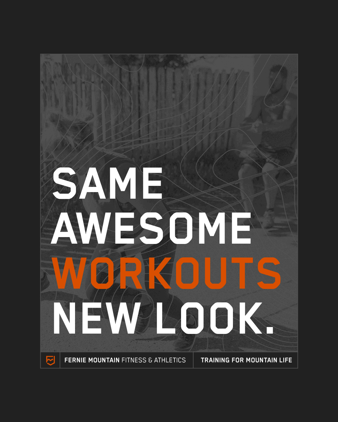
We like a bit of fitness over here, and since moving to town, Fernie Mountain Fitness has been our go-to spot to get a sweat on. The workouts are solid, the community is even better, and when Jana reached out to talk about a rebrand, we were all in.
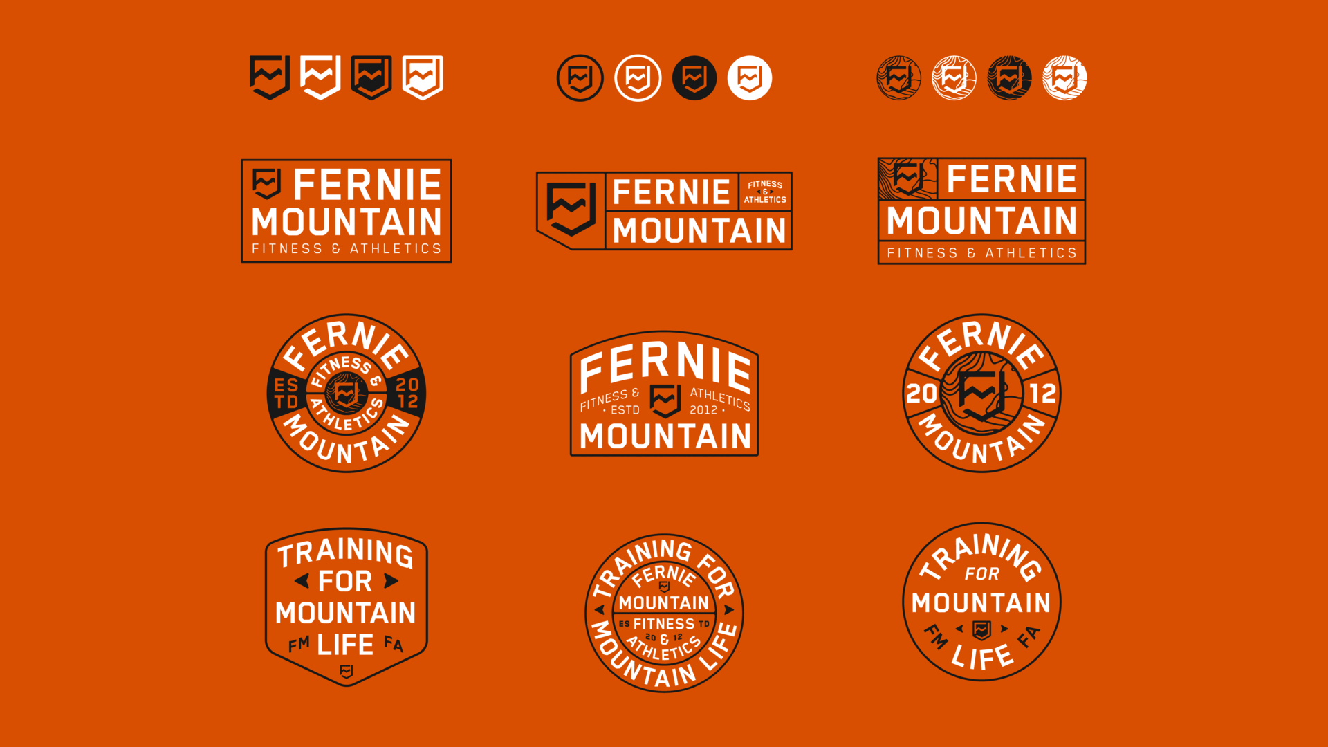
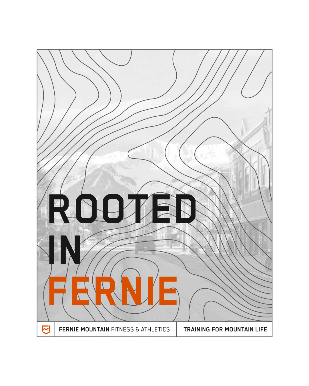
The goal? Create an identity that felt clean and elevated, but still grounded in old-school grit—pulling from varsity athletics and vintage camp-style badges to nod to both the “Fitness & Athletics” name and Fernie’s epic mountain setting.
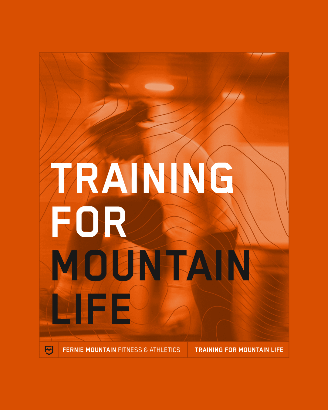
This town doesn’t train purely for looks, it trains for the mountains. Whether it’s long days on the slopes, big trail mileage, or all-day bike laps, people here train for a life outside. That led us to the brand’s new core statement: Training for mountain life.
Simple. Honest. True to why people show up. check out the identity below.