|
What We Use, Who We Are, and How We Keep Projects Sane ͏ ͏ ͏ ͏ ͏ ͏ ͏ ͏ ͏ ͏ ͏ ͏ ͏ ͏ ͏ ͏ ͏ ͏ ͏ ͏ ͏ ͏ ͏ ͏ ͏ ͏ ͏ ͏ ͏ ͏ ͏ ͏ ͏ ͏ ͏ ͏ ͏ ͏ ͏ ͏ ͏ ͏ ͏ ͏ ͏ ͏ ͏ ͏ ͏ ͏ ͏ ͏ ͏ ͏ ͏ ͏ ͏ ͏ ͏ ͏ ͏ ͏ ͏ ͏ ͏ ͏ ͏ ͏ ͏ ͏ ͏ ͏ ͏ ͏ ͏ ͏ ͏ ͏ ͏ ͏ ͏ ͏ ͏ ͏ ͏ ͏ ͏ ͏ ͏ ͏ ͏ ͏ ͏ ͏ ͏ ͏ ͏ ͏ ͏ ͏ ͏ ͏ ͏ ͏ ͏ ͏ ͏ ͏ ͏ ͏ ͏ ͏ ͏ ͏ ͏ ͏ ͏ ͏ ͏ ͏ ͏ ͏ ͏ ͏ ͏ ͏ ͏ ͏ ͏ ͏ ͏ ͏ ͏ ͏ ͏ ͏ ͏ ͏ ͏ ͏ ͏ ͏ ͏ ͏ ͏ ͏ ͏ ͏ ͏ ͏ ͏ ͏ ͏ ͏ ͏ ͏ ͏ ͏ ͏ ͏ ͏ ͏ ͏ ͏ ͏ ͏ ͏ ͏ ͏ ͏ ͏ ͏ ͏ ͏ ͏ ͏ ͏ ͏ ͏ ͏ ͏ ͏ ͏ ͏ ͏ ͏ ͏ ͏ ͏ ͏ ͏ ͏ ͏ ͏ ͏ ͏ ͏ ͏ ͏ ͏ ͏ ͏ ͏ ͏ ͏ ͏ ͏ ͏ ͏ ͏ ͏ ͏ ͏ ͏ ͏ ͏ ͏ ͏ ͏ ͏ ͏ ͏ ͏ ͏ ͏ ͏ ͏ ͏ ͏ ͏ ͏ ͏ ͏ ͏ ͏ ͏ ͏ ͏ ͏ ͏ ͏ ͏ ͏ ͏ ͏ ͏ ͏ ͏ ͏ ͏ ͏ ͏ ͏ ͏ ͏
|
FROM THE DESK | ISSUE 008
|
|
FIELD NOTES | Designing for the Client (and the Designer) After You
|
|
Ever opened an old project and thought, who the hell named this file “final_final_2_ACTUALfinal.ai”? Yeah. Us too. It’s easy to get so deep in a project that you forget someone else is going to have to live with it after you’ve packed up your fonts and moved on. But that “someone else” could be a future designer, a new hire, or, gulp, the client trying to figure out which logo to slap on a delivery van. That’s why we believe good design doesn’t stop at the visuals. It extends into the system. The logic, structure, and handoff that makes everything usable waaaay after the project wraps. Here’s a few things we always try to do before sending anything out the door: Name your files like a sane person. Dates, versions, and actual descriptions. “Logo_Primary_RGB” is your friend. “USETHISONE.ai”? Not so much. Build a guide people will actually use. Forget the fluff. Focus on real-world stuff. Logo spacing, color use, minimum sizes, and when to use what. Clear, simple, and non-scary. Organize deliverables like you're Marie Kondo. Break things into folders: Logos, Social, Print, etc. Then label them clearly, so no one’s left opening 14 files all named “logo.png.”
And the biggest game-changer? We use Playbook to hand it all over. It's like Dropbox got a design degree. Clean interface, image-first previews, and an intuitive structure that actually makes clients want to use their files. We create custom folders, drag in final assets, and the whole thing feels less like a messy handoff and more like an online brand library. Hit the button below to check it.
|
|
FRESH OFF THE DESK | Who’s actually behind the desk?
|
|
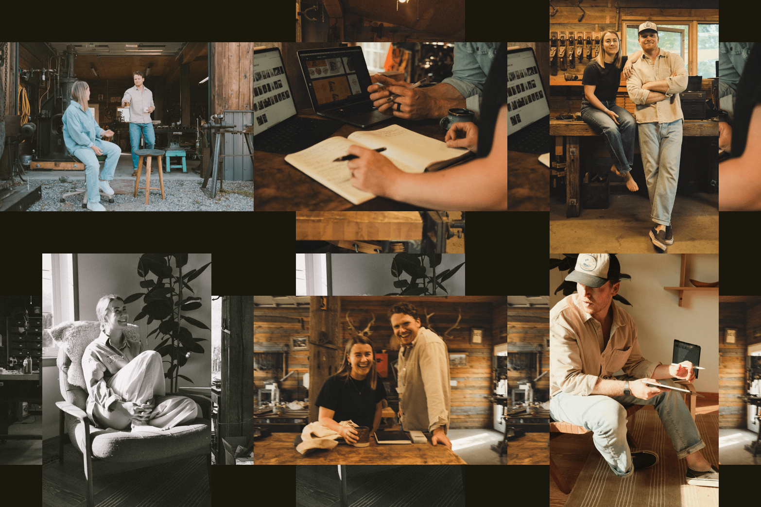
We’re switching things up this week. Not so much design, but a little more about the designers. Well, the designer, and the organiser. Or maybe it’s just a not-so-subtle excuse to show off our new headshots and give you a proper intro to the people behind the pixels. If you’re new here (or just quietly vibing in the background), you might be wondering who’s behind all these desk notes, brand tips, and strong opinions about file names. We’re Rory and Suz. Partners in business, life, and the occasional disagreement about colour palettes. Together, we run Idle Hands—a small-but-mighty brand & design studio based in Fernie, BC. We work with folks who care. People building things that matter. And we do it all with a pretty simple approach: strong creative built on strategy, collaboration, and not taking ourselves too seriously. If you’ve ever wondered what we’re actually like behind the brand tips and type nerdery, now’s your chance. You’ll get the backstory, the kinds of folks we work with, and maybe even a glimpse of us looking a little bit more put together than usual.
|
|
ON OUR RADAR | The Film Look, Without the Darkroom.
|
|
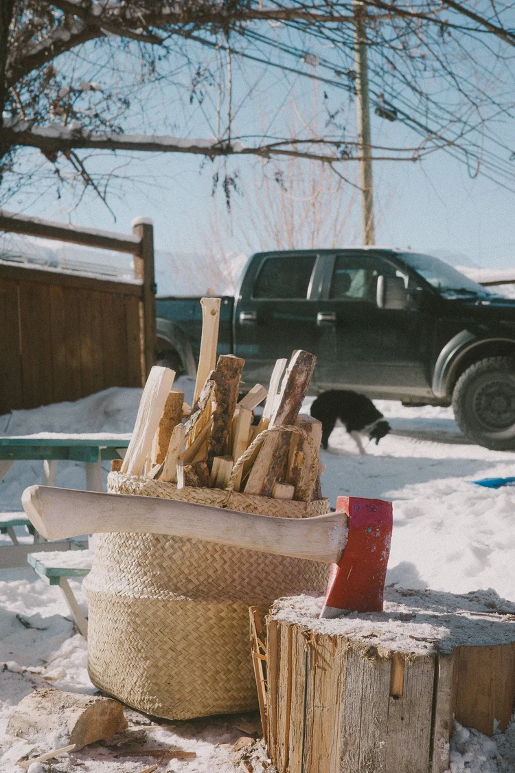
Rory here, and I’m going to lean into the photography focus we’ve got going on from the last section. I get a lot of questions about what I shoot on. And by a lot, I mean maybe 12 to 15 people. Which, when you’re not an iNflUenCer, is actually a ton of real-life humans. I love the look of film. The grain, the softness, the beautifully imperfect vibe. But honestly? I’m too lazy to learn film properly and way too short on time to scan rolls, or take a darkroom detour. I wanted something that gave me that feeling, without the admin. So I went with the Ricoh GR IIIx. The Ricoh’s been the perfect in-between. It fits in a pants pocket (like, actually fits), and lets me load a custom recipe to nail that filmy tone right out the gate It’s got a fixed lens, so there’s no overthinking or second-guessing. You pull it out, snap the shot. You get what you get, and you don’t get upset. For me this has helped just capture more real, raw moments, and fewer hours spent chasing “perfect.” I would highly recommend this if you’ve been camera-curious or just want something better than your phone without feeling like a wedding photographer, this one’s worth a look.
|
|
That’s a wrap on this week’s desk scribbles.
Whether you came for the handoff tips, the new headshots, or just a moment of inbox peace, we’re glad you made it. Catch you next Monday, same time, same desk. Rory & Suz
|
|
|
|