Blue Collar Brands, Race Day Ready & The Best Fonts Ever. ͏ ͏ ͏ ͏ ͏ ͏ ͏ ͏ ͏ ͏ ͏ ͏ ͏ ͏ ͏ ͏ ͏ ͏ ͏ ͏ ͏ ͏ ͏ ͏ ͏ ͏ ͏ ͏ ͏ ͏ ͏ ͏ ͏ ͏ ͏ ͏ ͏ ͏ ͏ ͏ ͏ ͏ ͏ ͏ ͏ ͏ ͏ ͏ ͏ ͏ ͏ ͏ ͏ ͏ ͏ ͏ ͏ ͏ ͏ ͏ ͏ ͏ ͏ ͏ ͏ ͏ ͏ ͏ ͏ ͏ ͏ ͏ ͏ ͏ ͏ ͏ ͏ ͏ ͏ ͏ ͏ ͏ ͏ ͏ ͏ ͏ ͏ ͏ ͏ ͏ ͏ ͏ ͏ ͏ ͏ ͏ ͏ ͏ ͏ ͏ ͏ ͏ ͏ ͏ ͏ ͏ ͏ ͏ ͏ ͏ ͏ ͏ ͏ ͏ ͏ ͏ ͏ ͏ ͏ ͏ ͏ ͏ ͏ ͏ ͏ ͏ ͏ ͏ ͏ ͏ ͏ ͏ ͏ ͏ ͏ ͏ ͏ ͏ ͏ ͏ ͏ ͏ ͏ ͏ ͏ ͏ ͏ ͏ ͏ ͏ ͏ ͏ ͏ ͏ ͏ ͏ ͏ ͏ ͏ ͏ ͏ ͏ ͏ ͏ ͏ ͏ ͏ ͏ ͏ ͏ ͏ ͏ ͏ ͏ ͏ ͏ ͏ ͏ ͏ ͏ ͏ ͏ ͏ ͏ ͏ ͏ ͏ ͏ ͏ ͏ ͏ ͏ ͏ ͏ ͏ ͏ ͏ ͏ ͏ ͏ ͏ ͏ ͏ ͏ ͏ ͏ ͏ ͏ ͏ ͏ ͏ ͏ ͏ ͏ ͏ ͏ ͏ ͏ ͏ ͏ ͏ ͏ ͏ ͏ ͏ ͏ ͏ ͏ ͏ ͏ ͏ ͏ ͏ ͏ ͏ ͏ ͏ ͏ ͏ ͏ ͏ ͏ ͏ ͏ ͏ ͏ ͏ ͏ ͏ ͏ ͏ ͏ ͏ ͏ ͏
Idle Hands

FROM THE DESK | ISSUE 009


FIELD NOTES | Blue Collar Brands. The next big thing.

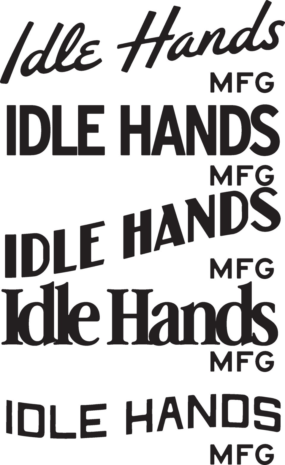
You may have seen our IG post about Blue Collar Branding. Over the past year, we’ve seen more trades & contractors come through our inbox than ever, and honestly? We’re damn here for it.

For a long time, good branding was reserved for coffee shops, breweries, and lifestyle startups. But that tide’s turning. Now, it’s your local electrician with a clean truck wrap. A painter with a wordmark you’d wear on a tee. A landscaping crew with a brand identity that looks like it belongs on a tote bag (in a good way).

And it makes sense. You’re not just building stuff. You’re building trust.

Your work happens in the spaces people care about most. Their homes, their families, their businesses, their futures. A strong brand says you’re worth trusting before you even answer the phone.

Please, no clipart hammers. No trying to make a letter out of a paint roller. Just clean, confident design for people who take pride in what they do.

If that sounds like you, we’d love to hear about what you’ve got goin’ on, and help build something that is as solid as your work.

 LET’S TALK B.C.B FOR THE FALL 
 

FRESH OFF THE DESK | Race Day Ready.

We were pumped to team up with the crew at ASICS again this year to design merch for the 2025 Vancouver Half Marathon. A series of tees, tanks, totes, badges and even the post-race poster and photo op backdrop. (More snaps of those to come.)

The brief was clear: Design pieces runners actually want to wear again, and again, and again. Not those tees that get worn on race day, and then stuffed under the bed, until you find them next time you move. Something with bold energy, crisp type, just enough edge to live beyond race day, and tie in with this years official race shirt. (which, *humble brag* we also designed.)

Whether you’re running for a PB or the post-race snacks, these pieces were made to move.

 GIVE ‘EM SOME LOVE 
 

ON OUR RADAR | The coolest Fonts around, that don’t even have to try.

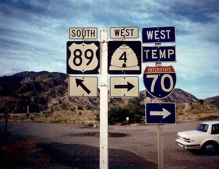
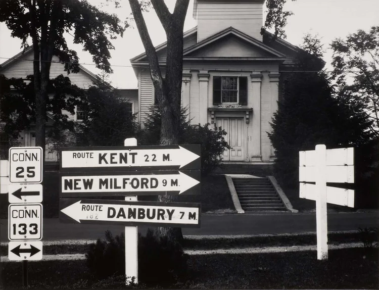
Let’s talk Highway Fonts. The kind of type that was never trying to be cool… but definitely is anyway.

Originally designed for signs you’d fly past, they’ve quietly become some of the most versatile, hardworking fonts in our toolbox. They weren’t made to be trendy—they were made to work. And that’s exactly why they feel so right in brand builds that want to keep it clean, honest, and a little gritty.

Here’s why we’re hooked:

  • They don’t try too hard. Function-first geometry. No fluff. No flair. Just structure and clarity.

  • They feel built with purpose. Like signage. Like blueprints. Like something you’d screenprint on the side of a van or find on a beat-up utility tag.

  • They go with everything. Brewery labels. Contractor vans. Tech startups. Hardware brands. They flex based on how you use them. Clean if you need them to be, rough and ready if you don’t.

Some of our go-to’s:

  • SAA Series

  • Highway Gothic / FHWA Series

  • Interstate

  • DIN 1451

  • Roadway

We’ve used some of these for branding projects (even our own brand), merch graphics, big headlines, wayfinding mockups, you name it. They just hit right. Every. Damn. Time.

If you want this kind of utility-meets-character vibe in your next brand build, we’re already there. And if you’re a designer deep in a type spiral, you’re welcome.


That’s the goods for this week.

Thanks for making time for us in your inbox. We’ll see you next Monday with more scribbles from the studio, design deep-dives, and probably a few more fonts we’re weirdly passionate about.

Stay sharp out there,

Rory & Suz

instagram pinterest

Idle Hands Design Studio
The Shoffice
Fernie, BC
Canada

Unsubscribe

Idle Hands